The New & Improved Re-TRAC Connect Experience
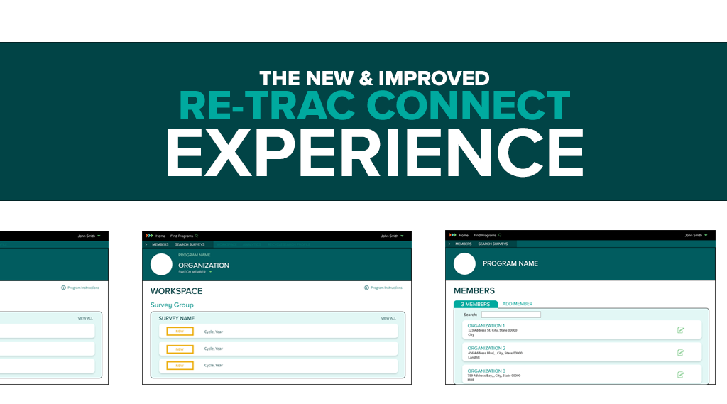

The New Re-TRAC Connect Experience!
At the end of 2016 we updated the Re-TRAC Connect brand and introduced a new logo and colour refresh. It was around this time that we decided to give our software a fresh new look. But modernizing the interface was only a small part of the project. We also sought to optimize workflows, improve language, and simplify reporting.
It should come as no surprise that we believe the best way to start any project is to collect data and then analyze the results before making any decisions. We started this project by launching a campaign to collect feedback from our clients and their program participants. The resulting feedback was invaluable to the process because it put the spotlight on some of the challenges we needed to solve.
What's New?
We redesigned the interface to optimize workflows, reduce visual clutter, and put focus on the actions that help you achieve your goals. There are three new pages we have introduced to accomplish this: the Home page, the Members page, and the Workspace.
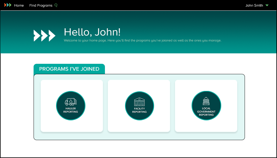
Home Page
This is the first page you see when you log in to Re-TRAC Connect. It's designed to provide quick access to the programs and directories you’re participating in. Programs will be added to your Home page as you join them. If you're a program manager, you will see the program(s) you manage here, too.
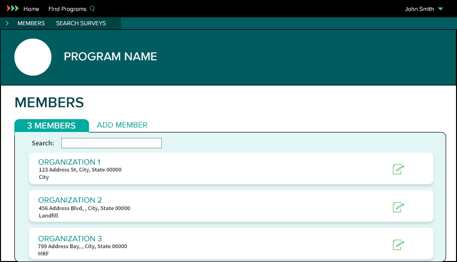
Members Page
Each program you join will have a Members page and it's where you will find all the members you have added to the program. You can also add another member to the program or edit an existing member's details. The most important thing to remember is that clicking the member name will take you directly to the member's Workspace.
Workspace
In an effort to streamline the reporting process, only the surveys you need to complete for the active reporting year are displayed. Surveys are organized into groups and the reporting cycle is clearly displayed next to each survey. You can always access a survey's historical data by clicking VIEW ALL.
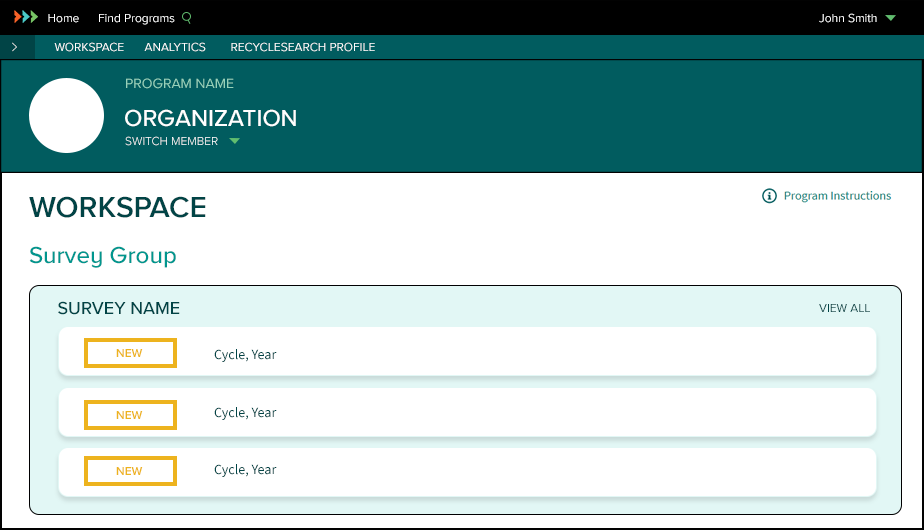
Survey Status Icons
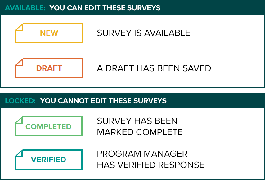
Another important change we made was to the survey status icons. There are four core survey status icons: NEW, DRAFT, COMPLETED, and VERIFIED. Clicking the icon will open the survey for editing (when available).
Survey Actions
Most surveys have two main actions: SAVE DRAFT and MARK COMPLETE. Saving a draft is a good idea when you’ve only partially completed a survey and don’t have time to complete your response. You can always return to a saved draft so you don’t have to worry about losing your work. Once all the required data has been entered into a survey, click MARK COMPLETE to finalize your response. This action will lock the survey and will no longer be available for editing. Once your completed survey response has been reviewed and cleared by the program manager, it will be marked VERIFIED.

Technical Support
Our technical support team is always ready to answer your questions. If you're having trouble navigating the new interface, please contact support here: